One experience.
An entire service
to rethink.
A signed-off technical direction would have broken the retirement journey across channels. I challenged the decision, helped reframe the service, then developed the future-state blueprint and testable experience.
Research and current/future blueprinting, UX & product design, cross-team challenge, accessibility escalation, experience direction and a testable prototype.
Backend solution changes, implementation, regulated policy and subsequent customer launch remained wider-team responsibilities.
The Executive Steering Committee later used the intervention as an example of putting accessibility and customer consequences earlier in project decisions.
See the choices.
Understand the consequences.
Explore your pension options
What could withdrawing money change?
Example pension · £186,400
£176,400 remains invested
£86,400 left after ten years
Compare the amount you take now with money available for later. Growth, tax, charges and inflation are excluded here.
Need reassurance?
Talk to a retirement specialist
Clear choices. Connected support.
User-satisfaction uplift associated with the later customer launch. My contract endpoint was the future-state blueprint and testable prototype.
Clarity, control and help.
In the palm of your hand.
Cash and income choices stay beside their consequences. A changed scenario makes the risk explicit; specialist support carries the amounts and the question forward.
Make room for
what comes next.
£176,400 stays invested after taking cash.
Without the £10,000 cash withdrawal, £96,400 would remain at year ten.
Calculation assumptions
Example pension £186,400. Fixed monthly withdrawals, with no growth, losses, tax, charges or inflation. Remaining balance is pension minus cash and withdrawals, with a floor of £0. These figures are a comparison, not a prediction.
A compact result, editable input pattern and comparison share one portrait view. Assumptions remain within reach.
More today.
What about later?
The selected balance reaches zero in month 112.
Taking no cash now would leave £18,400 at year ten under the same assumptions.
£156,400 after cash covers 111 full monthly payments, then £1,000. Consider a lower withdrawal or discuss the trade-off with a specialist.
Calculation assumptions
Example pension £186,400. Fixed monthly withdrawals, with no growth, losses, tax, charges or inflation. Remaining balance is pension minus cash and withdrawals, with a floor of £0. These figures are a comparison, not a prediction.
Show the change in cash and income, the depletion point and a clear route to revise or discuss the scenario.
Review what your choices mean for later.
Pick up where
you left off.
Your scenario and question stay together. Check them before sharing.
Discuss income needs, the comparison assumptions and the effect of tax.
Review the conversation summary
£186,400 example pension; £30,000 cash; £1,400 monthly withdrawal; balance reaches zero in month 112 under the displayed assumptions. Question: what does this mean for later?
A support bottom sheet keeps the scenario in view and prepares a reviewable summary before sharing.
People didn’t experience separate departments.
They experienced one broken journey.
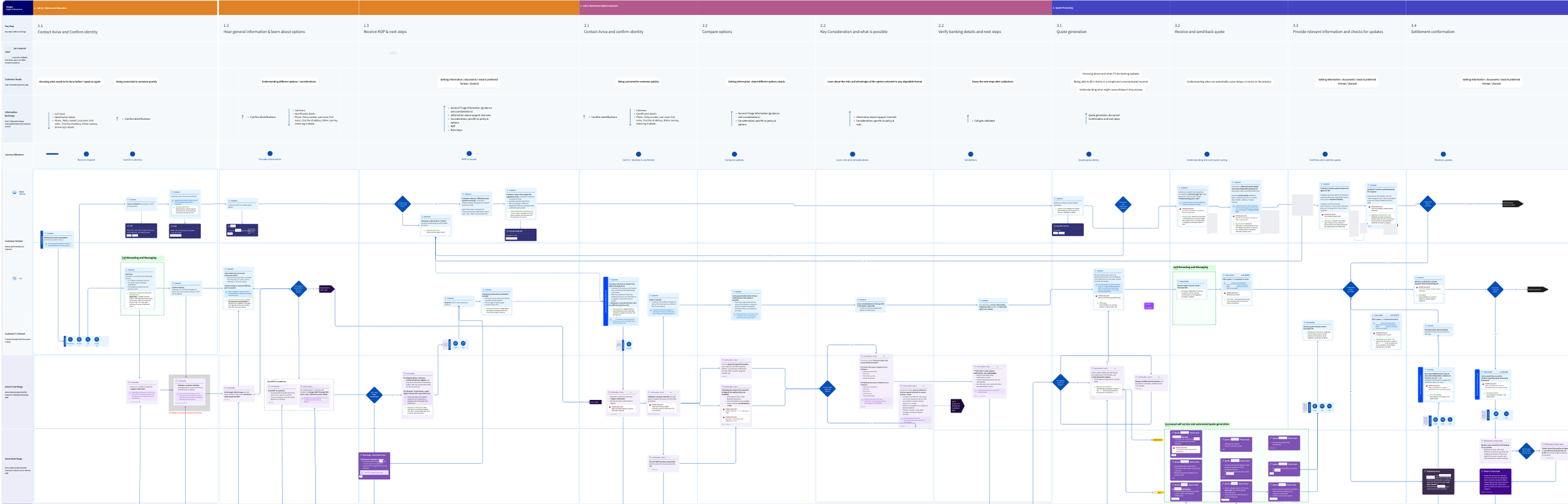
Pension drawdown was telephone- and paper-led. Customers wanted self-service with clear explanations and reassurance. Research, call-listening and conversations with operational practitioners showed where information and ownership were lost between digital, telephone and backstage processes.
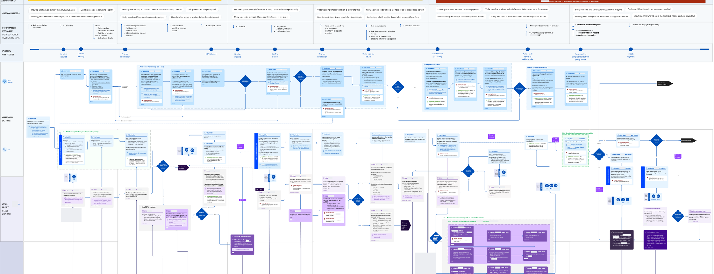
A consequential financial decision, often made with telephone reassurance.
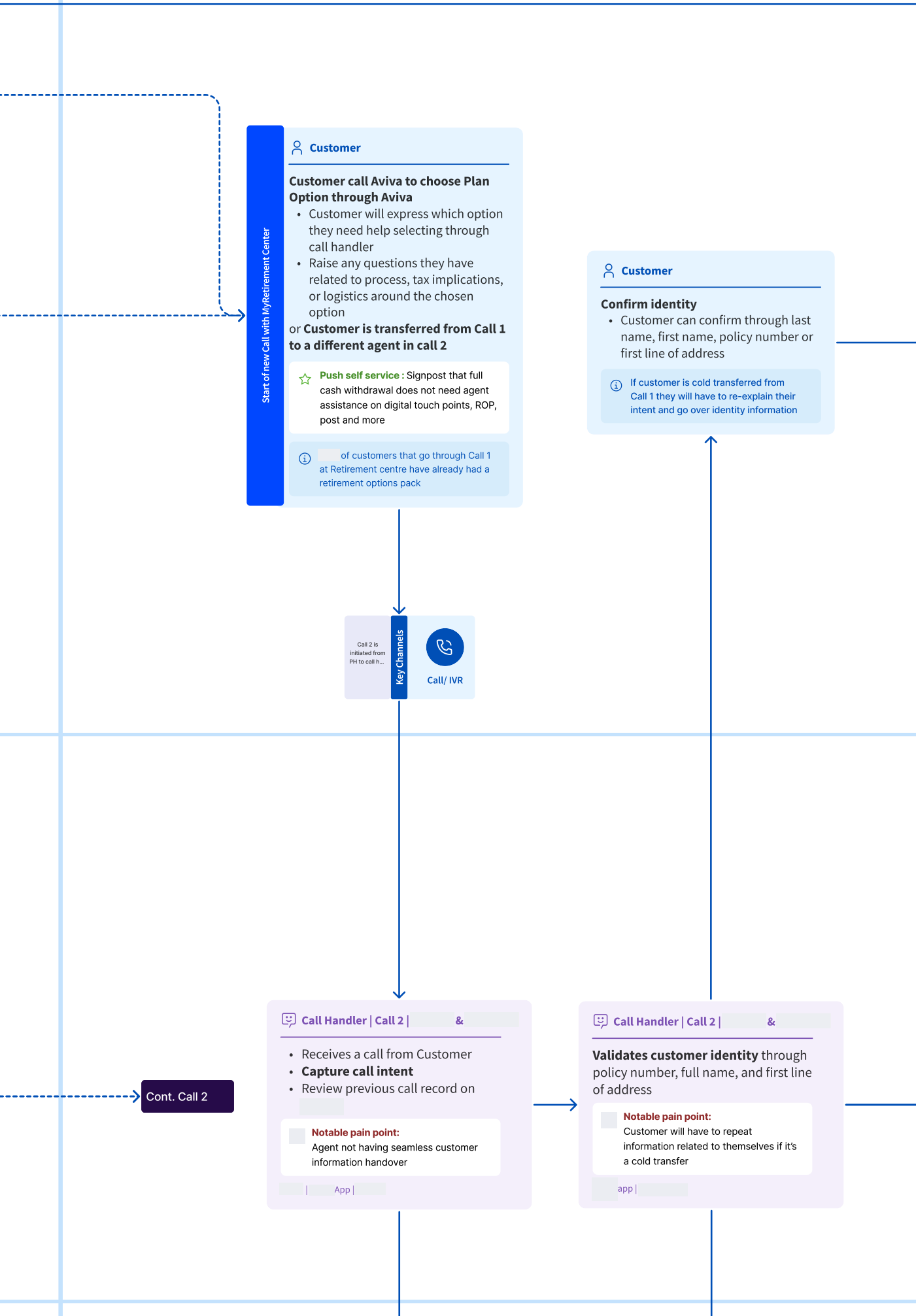
The next team could need information already supplied by the customer.
A digital front end alone could not resolve every service dependency.
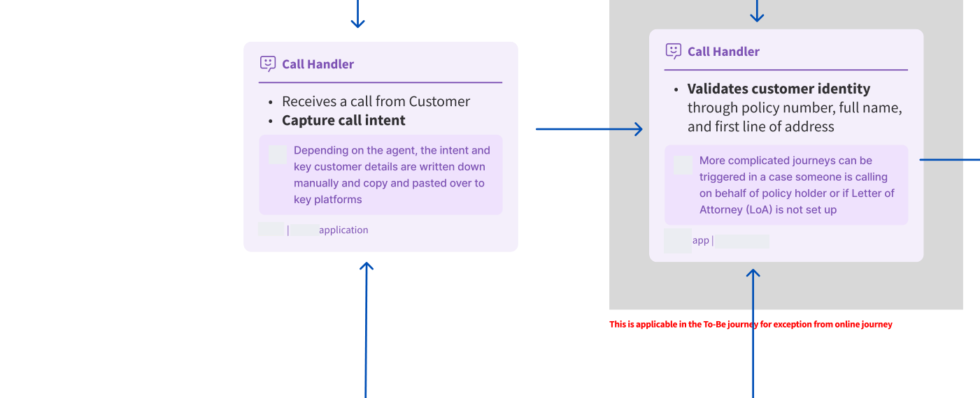
Read the blueprint’s key service relationships
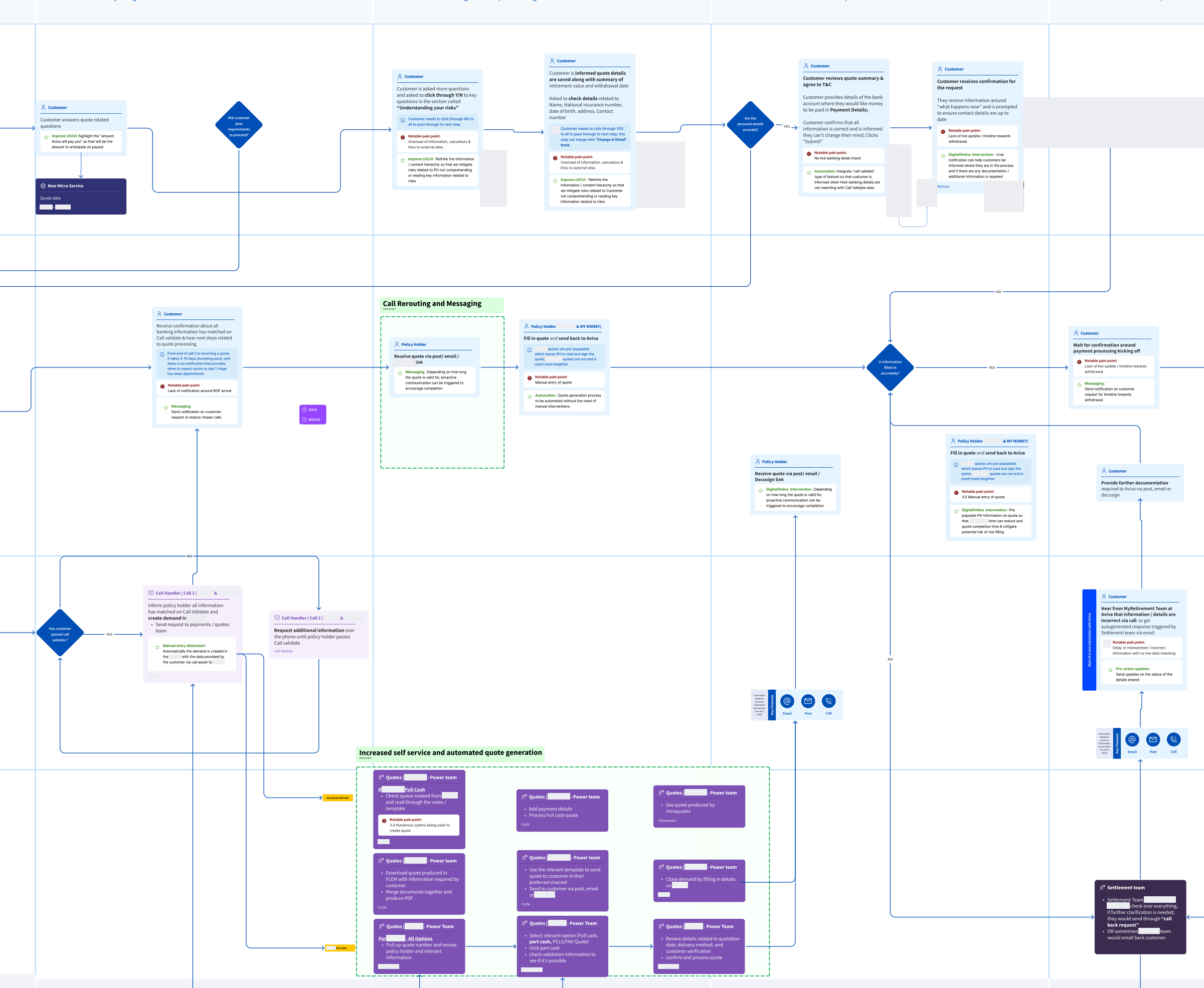
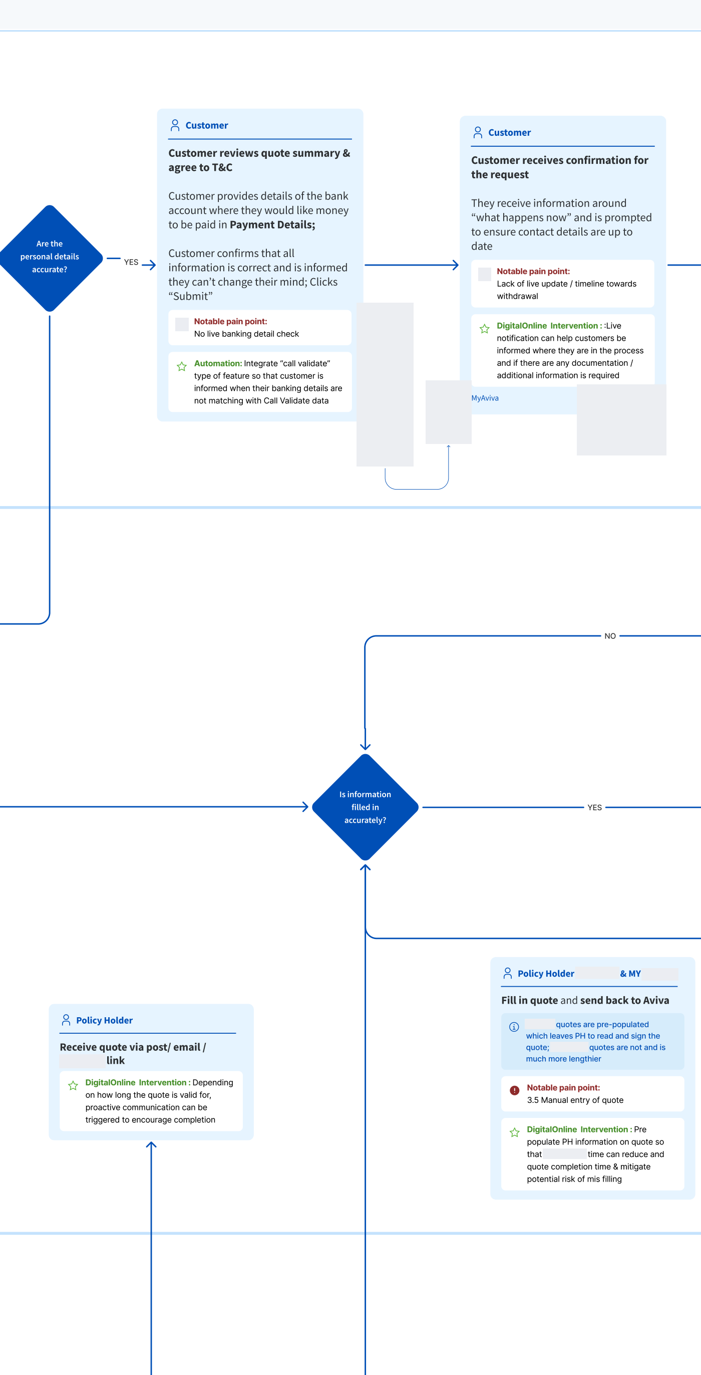
The customer first asks about retirement options and receives information. The online route and telephone route share questions about intent, identity and options. Call handlers provide visible help; quotation and administration teams work behind that interaction. Cold transfers can lose customer context. The analysis includes proposed digital interventions alongside the current service, so it is not an untouched “before” capture.
“We need to stop.”
The approved backend approach would have split the customer experience into online, offline and a separate online journey. I raised accessibility and Consumer Duty concerns, involved the Accessibility Lead and escalated the implications to the Digital Director.
Online → offline → separate online
The proposed route would have forced customers to change channels.
A complete online journey
Specialist support available without an enforced restart.
One connected digital route.
The project paused so the solution and backend could be reconsidered around a connected customer journey.
stakeholders involved at one point across the programme
Designed to work behind the interface.
The blueprint connected customer needs, channel activity, frontstage support, backstage operations and information movement. It made the product’s promises traceable to the service that would need to fulfil them.
Reassurance through the decision.
Understand options, consider a quotation and know what happens next, with specialist help available.
Keep the promise behind the screen.
Quotation processing, information continuity and clear operational ownership had to support the customer’s progression.
A handover. Not a do-over.
Make the choices legible.
Keep the human option.
My product work translated the service direction into simpler questions, known information carried forward with editing, contextual explanation and access to a retirement specialist.
The product challenge was to use information Aviva already held, remove unnecessary questions, explain choices in context and keep specialist support available without making customers start again. Working with the Content Editor, I shaped concise questions and contextual guidance.
The product examples keep cash and income choices beside their effect on money remaining, then carry the scenario and unresolved question into specialist support.
An editable forecast
The Guided Retirement Forecaster shows current setup, an edited forecast and a reset-confirmation state. These separate examples demonstrate comparison, reversibility and treatment of an income gap; they are supporting pension-product context rather than the drawdown transaction.
Income forecast
Based on your current setup
‘New state pension’ showing on forecast, at £12,000 a year from age 68
EditAll figures shown are shown in today’s money.
Remember these figures are only estimates. The value of your investments can go down as well as up and you could get back less than has been paid in.
The forecast is currently set to show your pension growing at a mid rate (1.6%).
Next steps
Will you have enough
to live on?
Compare your income forecast against the Retirement Living Standards:
- A standard from the PLSA based on research by Loughborough University
- Designed to help people picture what kind of lifestyle they could have in retirement
Call us
To make changes, or if you need help, call us on
0800 068 6800- Monday to Friday
- 8am – 5pm
- Saturday
- 8:30am – 5pm
- Sunday
- 10am – 4pm
For our joint protection, telephone calls may be recorded and/or monitored.
To show your current Guided Retirement setup on this forecast, reset the forecast.
Your edited income forecast
All figures shown are shown in today’s money.
Remember these figures are only estimates. The value of your investments can go down as well as up and you could get back less than has been paid in.
The forecast is currently set to show your pension growing at a mid rate (1.6%).
Next steps
Will you have enough
to live on?
Compare your income forecast against the Retirement Living Standards:
- A standard from the PLSA based on research by Loughborough University
- Designed to help people picture what kind of lifestyle they could have in retirement
Call us
To make changes, or if you need help, call us on
0800 068 6800- Monday to Friday
- 8am – 5pm
- Saturday
- 8:30am – 5pm
- Sunday
- 10am – 4pm
For our joint protection, telephone calls may be recorded and/or monitored.
Income forecast
Based on your current setup
No income predicted
The current forecast predicts no income over this period.
All figures shown are shown in today’s money.
Remember these figures are only estimates. The value of your investments can go down as well as up and you could get back less than has been paid in.
The forecast is currently set to show your pension growing at a mid rate (1.6%).
Next steps
Will you have enough
to live on?
Compare your income forecast against the Retirement Living Standards:
- A standard from the PLSA based on research by Loughborough University
- Designed to help people picture what kind of lifestyle they could have in retirement
Call us
To make changes, or if you need help, call us on
0800 068 6800- Monday to Friday
- 8am – 5pm
- Saturday
- 8:30am – 5pm
- Sunday
- 10am – 4pm
For our joint protection, telephone calls may be recorded and/or monitored.
Use what the service already knows.
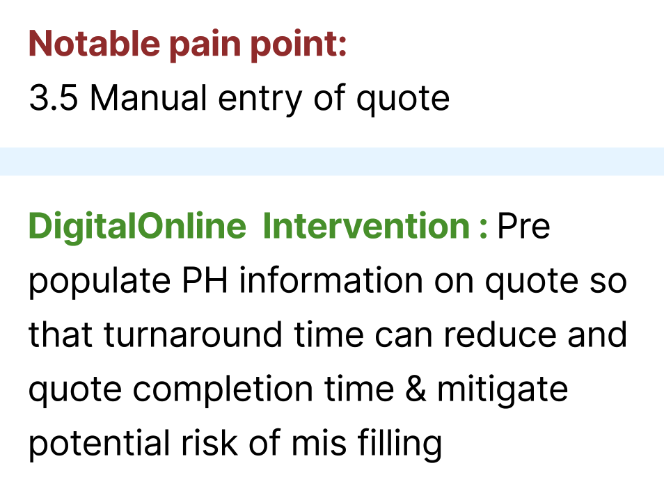
Service findingManual quote entry created extra completion effort and opportunities for mis-filling.
Product requirementCustomers need to check information, rather than supply it again. My direction was to carry known details forward and keep corrections local.
Interface consequenceState 01 carries the starting balance into a compact mobile comparison. State 02 makes changed amounts and the resulting risk visible together.
Service consequenceThe proposed pre-population intervention reduces re-keying across the quotation process; corrections must reach the teams using that information.
Explain the next step, at the right moment.
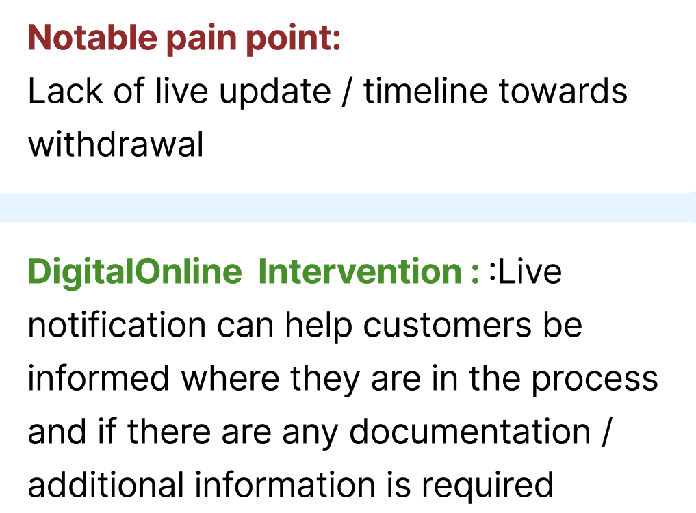
Service findingThe blueprint records a lack of live updates or a timeline towards withdrawal.
Product requirementCustomers need to know what happens next and whether anything is needed from them.
Interface consequenceState 03 uses a bottom sheet to keep the explored scenario distinct from a payment request and prepare a reviewable conversation summary before sharing.
Service consequenceA meaningful progress message depends on quotation teams supplying the actual status and any outstanding information. It should not imply completion before the service has completed its work.
Keep help within reach.
Service findingCold transfers could make customers repeat their intent and identity information.
Customer needReassurance from a retirement specialist without starting the journey again.
Interface decisionI made live chat and a dedicated telephone route part of the experience direction. State 03 keeps the selected amounts, income scenario and unresolved questions beside the support route.
Service consequenceRetirement-centre operatives need the customer’s place and context to continue. The handoff is a service requirement as well as a visible help entry point.
A different decision.
A better service direction.
Estimated +40%
User-satisfaction uplift. Customer launch followed my direct contract deliverables; the measurement method, sample and timeframe are not established in the available evidence.
Research and current/future blueprinting, UX & product design, cross-team challenge, accessibility escalation, experience direction and a testable prototype.
Backend solution changes, implementation, regulated policy and subsequent customer launch remained wider-team responsibilities.
The Executive Steering Committee later used the intervention as an example of putting accessibility and customer consequences earlier in project decisions.