“It was so simple that I almost forgot it was helping me — just a tap, and I felt seen again.”
- John, TapGive pilot participant
TapGive
- Dignified Donations.
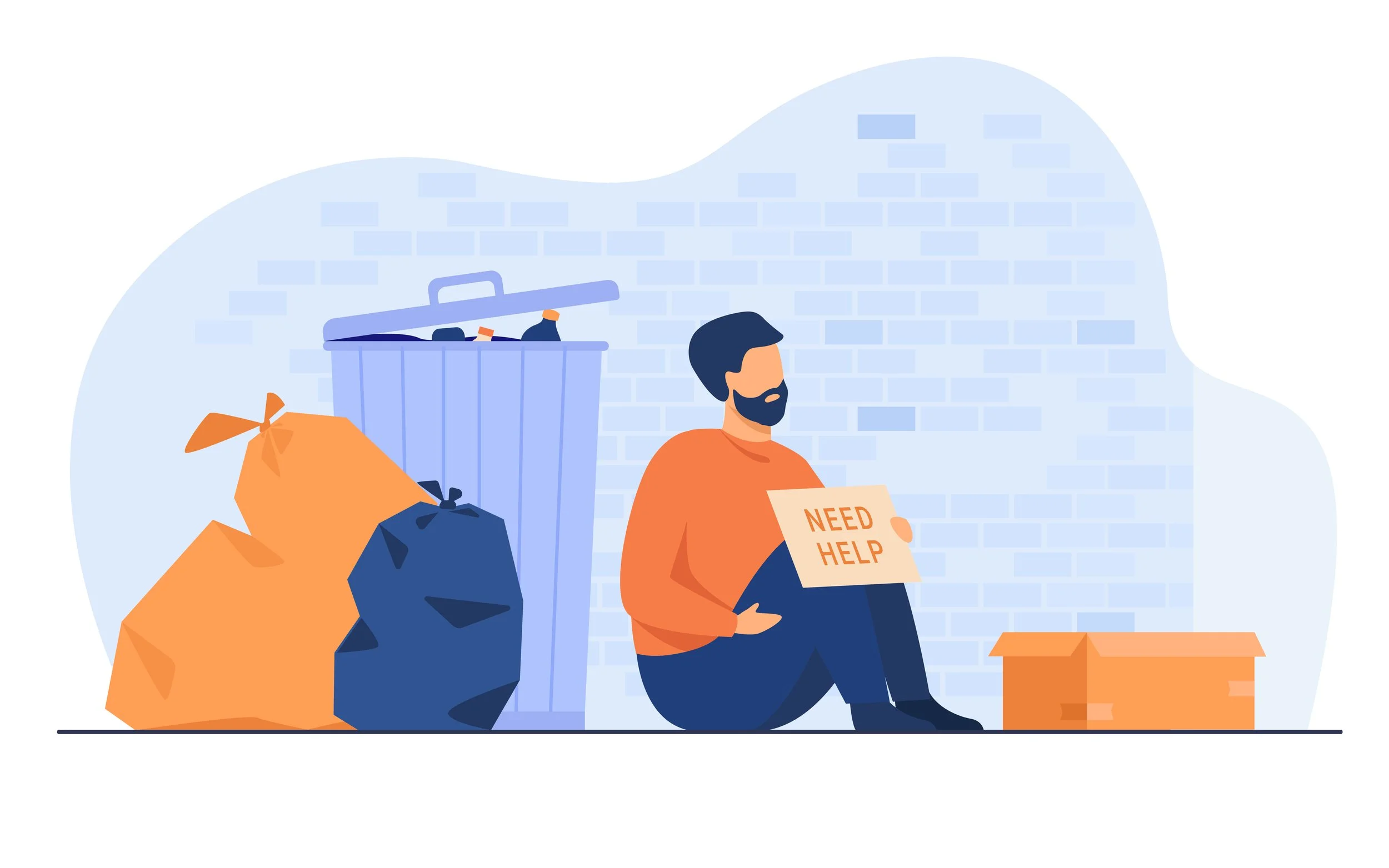
Imagine stepping out of San Francisco’s Embarcadero Station on a rainy Tuesday. You pass someone holding a cardboard sign. You feel that familiar pang, but the only thing in your wallet is a contactless card and maybe a loyalty stamp.
You tell yourself you’ll donate later, but that moment usually disappears.
TapGive was designed to close that intention-action gap.
The concept used an NFC and QR-enabled badge worn by the recipient, with a simple donor flow on a smartphone. The aim was to make giving as fast as dropping coins into a hat, while protecting the recipient’s dignity, safety and visibility.
The challenge was not just making a payment quicker.
It was designing a sensitive public interaction between two people: one who wanted to help, and one who needed support without being turned into a spectacle.
TL;DR
TapGive
The opportunity
In a cashless society, spontaneous generosity is becoming harder.
Cash payments have fallen sharply, while rough sleeping has risen. In research with 115 participants, 80% of donors said they wanted to give but could not because they had no cash, and 62% reported feeling guilty afterwards.
Recipients, meanwhile, faced repeated rejection, public judgement and uncertainty.
The approach
I designed TapGive using a dual-track process of Design Thinking and Agile iteration, with accessibility checked throughout against WCAG 2.2.
Through field research, journey mapping, rapid prototyping and concept testing, the strongest direction became a hybrid NFC and QR badge: simple for donors, low-maintenance for recipients, and fast enough to work in a real street interaction.
The result
Testing showed a clear improvement in the donation experience:
Transaction time dropped from around 30 seconds to under 3 seconds
Recipient dignity scores rose from 50% to 80%
Donor satisfaction increased from 60% to 85%
No fraudulent transactions were logged during pilot validation
The strongest feedback was not just that TapGive was quick. It was that the interaction felt more normal.
One donor described it as:
“It felt like a normal transaction — not charity.”
Giving in a cashless society.
Cash payments have fallen sharply, but the need for spontaneous giving has not gone away.
The problem is that the people most affected by that shift are often the least able to benefit from digital payment systems.
For donors, the barrier is simple. They may want to help, but they have no cash, no time, and no clear way to give in the moment.
For recipients, the problem is deeper. Many people experiencing homelessness do not have easy access to a smartphone, bank account or reliable digital payment route. They are also exposed to judgement, humiliation and sometimes violence when asking for help in public.
In the research, 80% of donors said they wanted to give but walked past because they had no cash. 62% said the guilt stayed with them afterwards.
John, one of the participants, put the other side of the problem more clearly:
“Money isn’t what I’m begging for — it’s acknowledgment that I exist.”
The challenge was clear: design a way to give that felt as fast and natural as contactless payment, while preserving dignity and trust for both giver and receiver.
Listen to understand.
I began by looking at both sides of the interaction: the donor and the recipient.
Sarah represented the donor journey: someone who uses her phone for everyday payments, wants to help, but has not carried cash for years. She described the frustration of walking past someone because she had no practical way to act in the moment.
John represented the recipient journey: someone who starts the day with cautious optimism, but has to absorb repeated refusal, silence and public judgement.
The research helped show that this was not simply a payment problem. It was an emotional and social interaction with friction on both sides.
Synthesising more than 200 insights, four critical clusters emerged:
Donor barriers
Recipient needs
Technology gaps
Accessibility requirements
The strongest product opportunity sat at the intersection of those clusters.
The solution had to be fast, dignified and trustworthy.
That led to the north-star question:
How might we enable fast, cashless donations that preserve dignity for both giver and receiver?
Move quickly.
I developed the concept through a dual-track approach, combining Design Thinking with rapid Agile iteration.
Each cycle moved between research, prototyping, testing and refinement. Accessibility was treated as a constraint throughout, not something to check at the end. Every review considered WCAG 2.2 requirements.
I explored a wide set of directions, from barcode wristbands to kiosks. Impact-versus-effort mapping pointed to a stronger route: a hybrid NFC and QR badge.
That direction worked because it reduced the burden on the recipient.
They did not need to own a smartphone, manage an app, charge a device or repeatedly explain how the system worked.
Early prototypes uncovered important details:
Donors preferred preset but editable amounts
Recipients wanted confirmation that was visible enough to acknowledge the donation, but subtle enough not to draw attention
The interaction needed to feel almost immediate, otherwise people would abandon it
Within 72 hours, I had moved the concept into a working prototype: a 3D-printed badge with an NFC tag, supported by a lightweight app prototype.
The goal was not to perfect the interface in isolation. It was to find out whether the interaction could work in the real world.
The solution to cashless.
TapGive turned giving into a short, discreet and more dignified interaction.
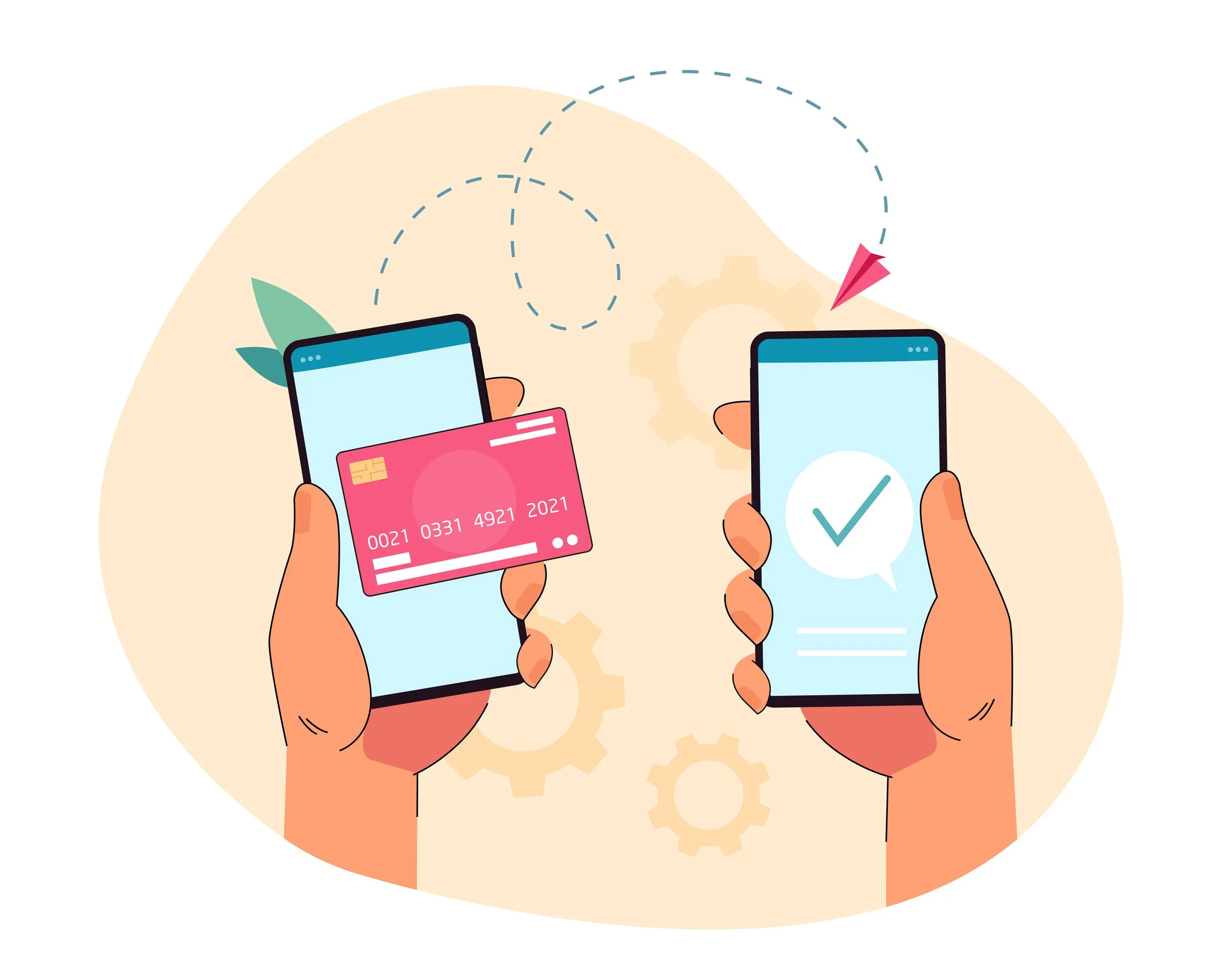
Sarah sees John’s badge with a simple “Tap to Give” icon. She taps or scans the badge, confirms a preset donation, and receives immediate confirmation.
John receives a discreet signal that the donation has worked.
That small confirmation mattered. It gave the recipient acknowledgement without forcing them to perform gratitude, explain their situation or draw more attention to themselves.
Several design choices made the system practical:
Hybrid NFC and QR supported reliability across different devices and environments
Preset donation amounts reduced friction while still allowing choice
Discreet recipient confirmation protected dignity
Low-cost badge production made the model easier to scale
Future iterations explored haptic feedback and tactile markers for accessibility
The other side of the system was redemption.
Recipients could use donated funds through participating merchants, such as cafés or pharmacies, without needing to manage a conventional payment app.
That made the product more than a donation trigger. It created a fuller service loop: donor, recipient, merchant and redemption.
Did it work?.
Testing showed the impact of designing around speed, dignity and trust.
The donation moment became faster and easier to complete:
Donation time dropped from around 30 seconds to under 3 seconds
Recipient dignity scores rose from 50% to 80%
Donor satisfaction increased from 60% to 85%
No fraudulent transactions were logged during pilot validation
The important result was not only speed.
The interaction felt less awkward.
Donors could act on their intention without hesitation. Recipients could receive support without the same level of exposure or uncertainty.
One recipient captured the change clearly:
“It was so simple that I almost forgot it was helping me — just a tap, and I felt seen again.”
Launch.
The pilot launched in San Francisco’s Financial District with 50 badges and 10 merchant partners.
The launch model was deliberately controlled. It needed to test the whole system, not just the app:
Badge issue and setup
Donor interaction
Donation confirmation
Recipient acknowledgement
Merchant redemption
Fraud and misuse monitoring
Operational support
If successful, the next stage was designed to scale to 5,000 badges and 300 merchants across the Bay Area.
The backend approach was planned to be low-cost and resilient, keeping badge costs to around $2–3 each.
The awareness campaign focused on a simple message:
“See this badge? A tap could change someone’s day.”

Upon reflection.
TapGive reinforced my belief that the most meaningful design work often sits inside small, emotionally charged moments.
This was not just a payment problem.
It was a moment of guilt, rejection, hesitation, visibility, trust and dignity.
For donors, TapGive turned hesitation into action.
For recipients, it replaced some of the exposure of asking with a more discreet form of acknowledgement.
Research is not finished when you understand the problem. It is finished when you are compelled to act responsibly on what you have learned.
TapGive was not just about building a payment tool.
It was about designing dignity back into the everyday act of giving.